
Project Overview
The Project
Redesigning the mobile booking experience for a permanent makeup artist to increase conversions by 82%
My Role: UX designer
Tonya, a licensed cosmetologist with 20 years in the beauty industry and 5 years specializing in permanent makeup, was losing potential clients due to a complicated mobile booking process. Her existing app required multiple steps and confusing navigation to schedule appointments.
As a solo business owner running Highbrow Society, she needed a streamlined, mobile-first solution that would let clients easily browse services, view her portfolio, and book appointments independently.
The Challenge
The Goal
• Reduces booking friction by 60%
• Showcases Tonya's portfolio and expertise
• Automates appointment management
• Builds trust with first-time clients
• Simplifies complex service pricing
Design an intuitive booking platform that:
Impact Goal
Increase online bookings by 75% in first quarter
Target Audience
Women 25-45 seeking premium beauty services
Timeline
6 weeks from researcher to final prototype
I conducted user interviews with 12 potential clients and analyzed the existing Highbrow Society app to identify pain points in the booking flow.
Research & Discovery
85% of users wanted to see clear pricing before contacting the studio
78% preferred booking via mobile during commute or lunch breaks
First-time clients needed extensive portfolio proof and credentials
Average 4.2 touch points required before booking confirmation
Key Findings
Personas
Based on research, I created two primary personas representing our target users.
Tammy
56 years old, Paralegal, Uses mobile for everything
Goals
Save time on everything
Looks polished for work
Book during lunch
Pain Points
Limited availability for phone calls
Needs instant booking confirmation
Worried about results
Lindsey
31 years old, Stay-at-home mom, Small Town Area
Goals
Understand aftercare
Research extensively
Needs something to quick for busy life
Pain Points
Nervous about permanent changes
Confused on packages
Needs to see credentials
Design Process
I followed a user-centered design approach with continuous iteration.

Sketched wireframe concepts focusing on minimal-click booking flows, along with creating a journey map through the process
Ideation
Wireframing
Created low-fidelity wireframes for mobile-first experience
Prototype
Built high-fidelity interactive prototype in Figma
Testing
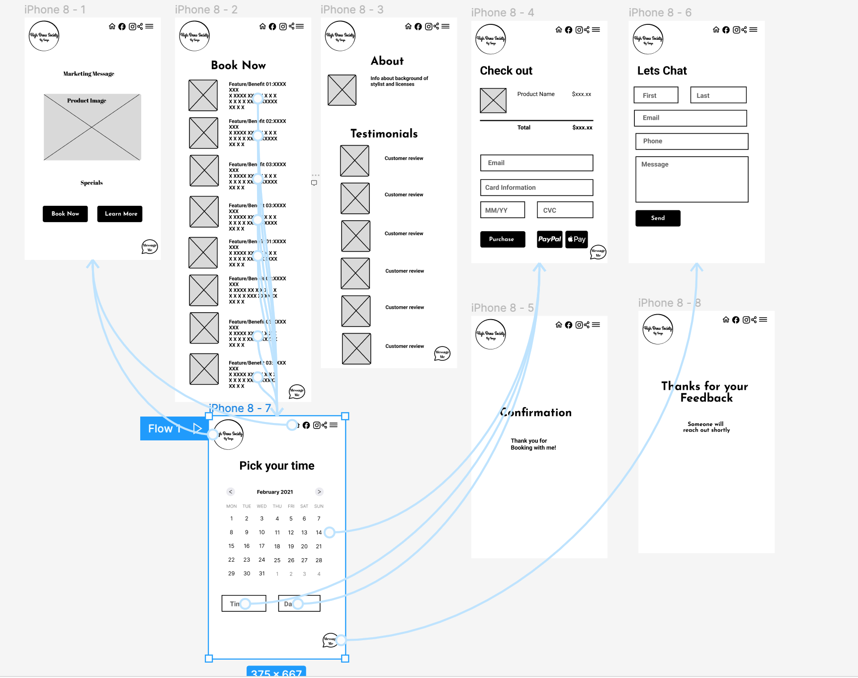
Design Solutions
Conducted usability tests with 8 participants
Key features designed to address user pain points and streamline the mobile booking experience for Highbrow Society.
Before
Carousel on home (hard to navigate)
Long scrolling service list
Complex pricing with deposits buried
Book Now button with no context
Testimonials separate from portfolio
After
Portfolio grid easy browsing
Service pricing with easy breakdowns
Clear deposit + total cost display
About Tonya (credentials & experience)
Integrated testimonials with photos
Streamlined 3-step booking
Results and Impact
The redesigned platform launched in Q4 2025 and exceeded all KPI targets within 3 months.
increase in online bookings
3x
Reduction in admin time
4.9/5
More new client inquiries
User satisfaction score
"The redesigned app has been a game-changer. Clients understand the pricing, and I spend less time answering the same questions."
-Tonya, Business Owner
Key Takeaways
65%
82%
"My eyebrows healed up nicely! The new app made it so easy to see what to expect and book my touch-up."
-Tabitha, returning client
What Worked
Portfolio-first approach built immediate trust
Transparent pricing eliminated hesitation
Mobile-optimized flow matched user behavior
Automated booking freed up the owner's time
Future Improvments
Add PDF downloads of aftercare
Implement discounts for repeat clients
Expand educational content library
A/B test different booking flows
I'd love to share more details about the research process, design decisions, or technical implementation.
Want to discuss this project?